Research
Engaging the audience
Eola stay close to their users. In a week, we ran dozens of calls and tests to learn about them, the product, what works and what should be improved.
--
Instructor
"We’ve never used class passes before."
--
Owner
"If the organiser's name is wrong, it prevents us from doing anything with it."
--
Instructor
"Your current widget isn’t the best-looking one, but at least everything is visible on one page."
--
Instructor
"From a legal standpoint, it's not strong to have privacy policies and disclaimers at the end of the checkout."
--
Center
"We run a lot of activities, and the problem we’ve had with our website is that it was getting overcrowded."
--
Owner
"Many people get confused by vouchers and don’t notice the 'I have a voucher' option right away."
--
Instructor
"We run a lot of activities, and the problem we’ve had with our website is that it was getting overcrowded."
Profiling
Defining users
We used all these conversations to break down users into categories. Three types of ticket buyers, three types of professionals, each with their own needs.

Consumer 1
It’s a passion
"I am more likely to book spontaneously based on free time or weather conditions."

Consumer 2
It’s an experience
"I don't have a specific activity in mind, so I'll decide based on what I find online."

Consumer 3
I am a parent
"I want them to be safe and confident that I'm signing them up for quality activities."

Client 1
I own a small center
"My business is just enough to keep me going. No need to scale it, I’m good with how things are."
client 2
I’m an instructor
"I’m not running the show, but I’m pretty hands-on, definitely involved."
client 3
I'm a large business owner
"I run a large leisure center that brings in millions a year, I am picky about my booking system."
Ideation
Learning, sketching, repeat
We turned what we learned into daily sketches and wireframes, testing them with each new user and refining as we went.

--
Instructor
Looking for practical information straight away, like an FAQ, for example.
--
Instructor
"We use double kayaks. It's useful for us to meet the minimum number of people required for booking."
--
Consumer
"I expect to see all information related to the centre, the equipment, more images, and reviews."
--
Consumer
"Are refreshments provided, or should you bring your own food?"
--
Instructor
"If it’s going to be a long page, I’d like to see some kind of bar that makes all the content accessible."
--
Owner
"Price is the most important. What am I doing? Anything else (location, reviews, etc.)?"
--
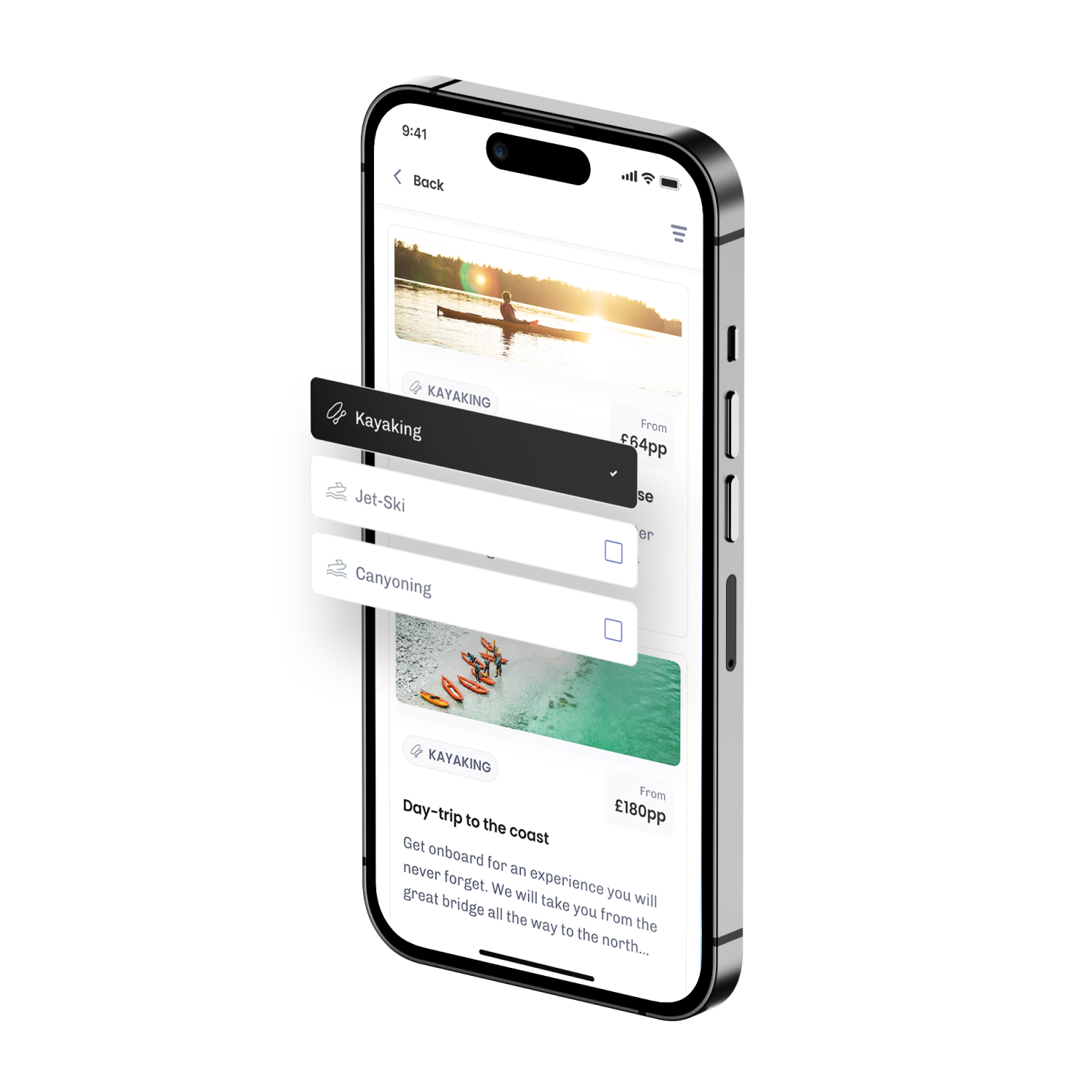
Consumer
"I’d love to be able to filter activities by location."
Validation
Leveraging prototypes
I built prototypes to test each flow, watching users move through it and share their thoughts along the way.